Opportunity
London-based startup ten80 engaged Milkable to help evolve their brand.
They needed to be seen by key decision-makers in SAP client companies as an innovative, agile, and purpose-driven platform which fundamentally delivers exceptional value to its clients by changing the way people work.

Strategy
Our strategy was to leverage the power of the brand name, derived from the idea of ‘doing a 1080’ (i.e. three full revolutions) which, in board-sports, is something truly awesome to achieve.

Brand Design
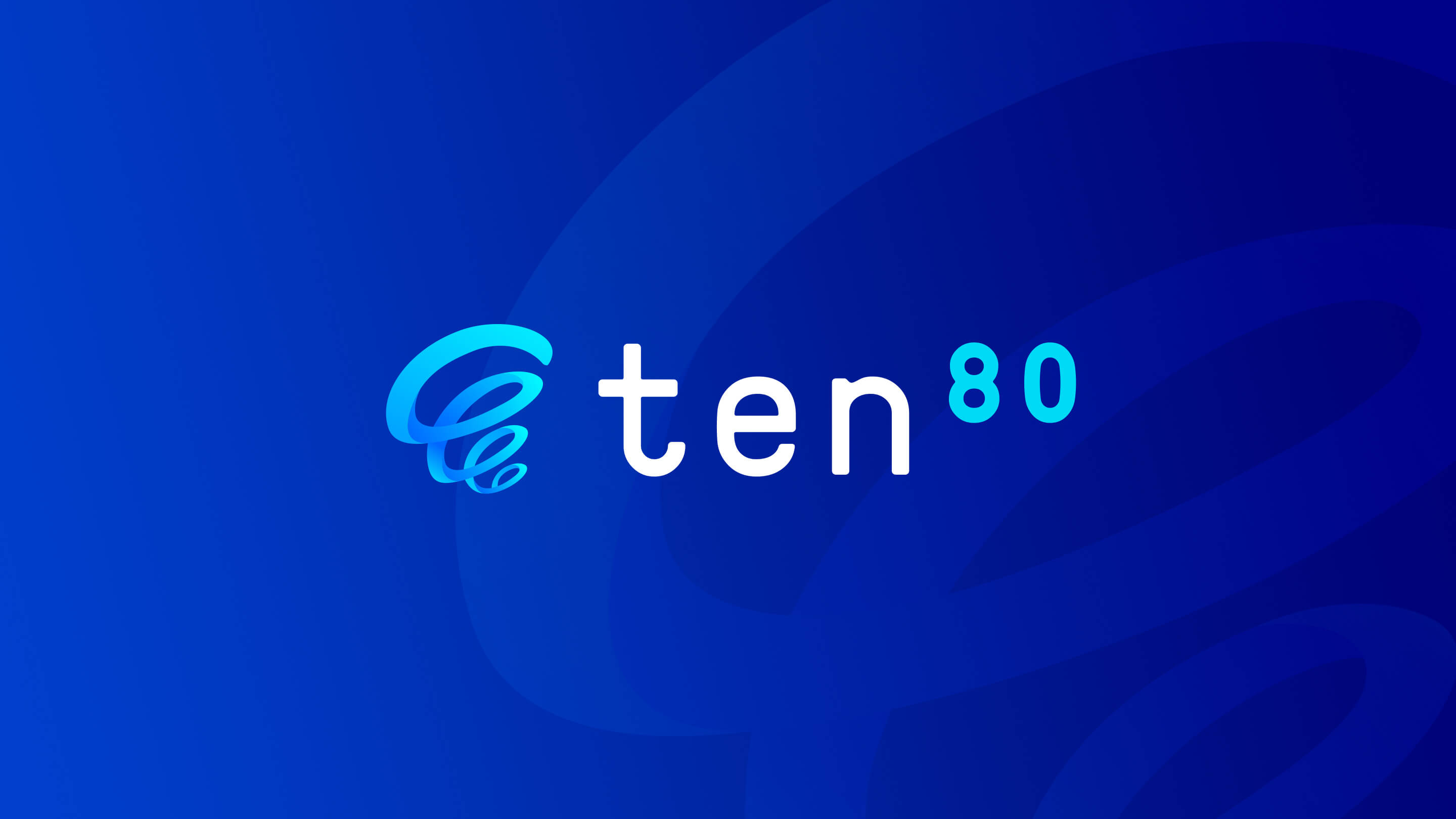
The logo concept uses a unique symbol to represents the motion of a 1080º spin. It features the numbers “80” as a superscript, similar to the degrees º symbol – a connection to 1080º and the meaning behind the name ten80.
Website
When designing the customer-facing website, we had the challenge of wading through endless corporate IT and recruitment lingo in order to communicate to both SAP contractors and the enterprise-level clients looking to hire contractors.
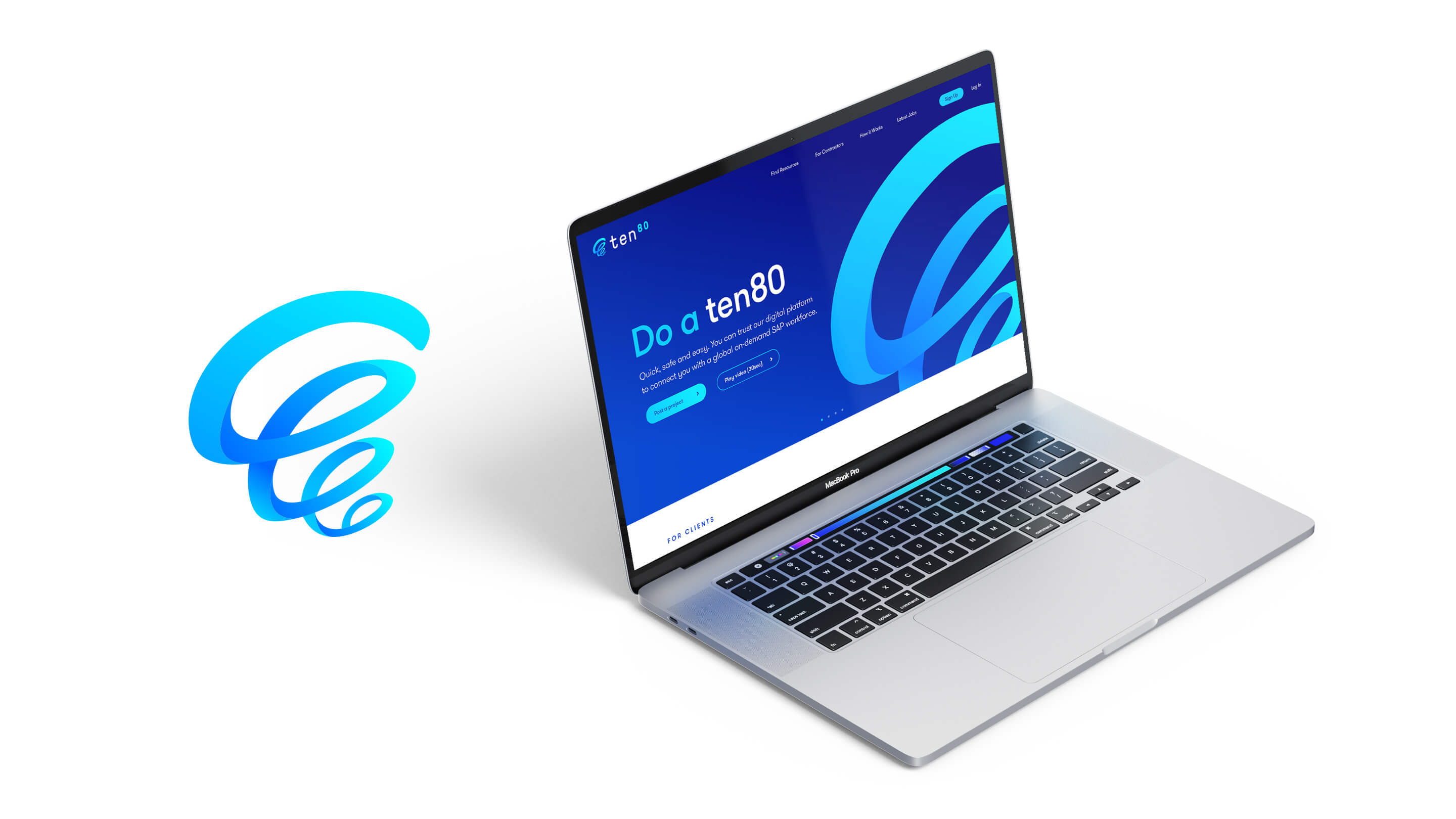
The solution was to create a succinct, clean and highly visual website which conveys just how easy it is to use the ten80 platform.


3D Animation
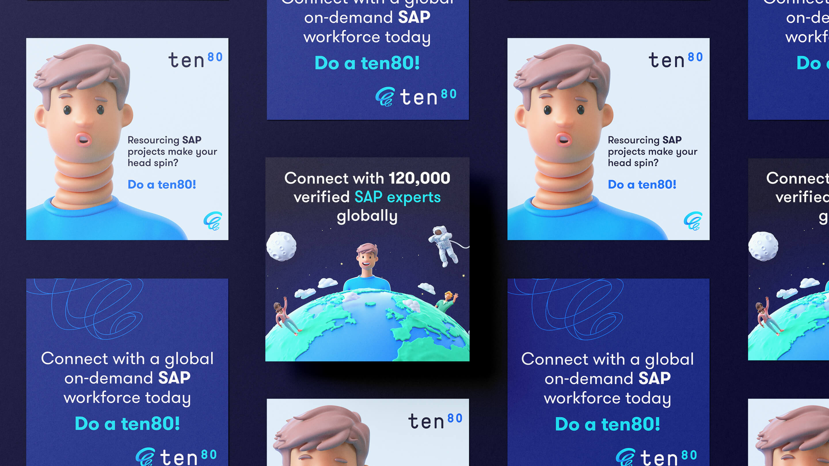
Playing on the idea of a 1080º spin, we used 3D animation to illustrate the frustrations of hiring good contractors and how ten80 makes it easier. The colourful, punchy visuals and short-form video worked extremely well in digital advertising.

In their own words
The Milkable team were truly professional in our engagement. They spent time understanding our business and our customers challenges, then created relevant campaigns that spoke to those value propositions.
A big thank you for a great job.


 Menu
Enquire now